A data based look at governments‘ education expenditure during the 2010s

by Arno Waschk 1 Apr 2025
Introduction
There are many different concepts how gouvernments contribute to the education system. While poor and rich countries differ wildly in theri abilites of spending money, there is still different political strategies in either the general importance of the education system, as well as in how much the gouvernment should contribute to financing the education system of a particular country.
Many aspects of this are part of a political viewpoint, and of personal preference. But can we find some help in data? Can we see if gouvernment spending has good or bad or no effect?
We took the opportunity to look into the data which is provided for many countries by the Worldbank.
There is a plethora of data for this topic, although unfortunately only few data points are given for manx countries in the same year. Still we could gather data columns for gouvernments‘ expenditure in education, as well as those separated in primary, secondary and tertiary education.
Part I: How is gouvernment spending found in our data?
For investigating the data we chose to look at the four mentioned data columns, for each available country world-wide. To be able to measure an effect we need to be able to compare which effect gouvernment spending might have had some years later, so we chose data from 2010.
While not all 200+ countries have valid data entries we could find 84 countries which we also found to have valid target data in 2018, the year we chose to measure effects in, which will be shown in Part II.
Here the map showing which countries we have data from:
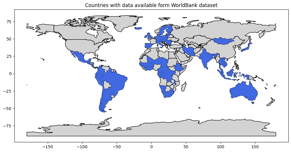
While it is unfortunate that many countries are missing, we can still see that our data comprises countries from all the continents and in a wide geographic variety.
Before diving deeper in our investigations, find below the correlation matrix for our data of education expenditure, in total and for the three mentioned fields:
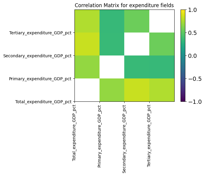
The more yellowish the squares the stronger the correlation. We can see that correlation is significant, but visibly lower for all correlation pairs which include primary education.
To get a better impression about the distribution we also look at the following graph:
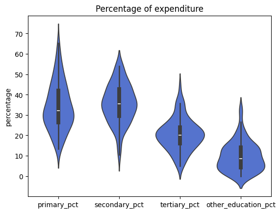
It shows that, although there is variety, most spending usually goes into secondary education and primary education, the latter showing high peak values in rare cases. Tertiary is less, but one should note that this is per country, not per student; typically tertiary education sees significantly less students than the earlier stages. („Other“ simply means the difference between the total expenditure and the sum of primary, secondary and tertiary. From the plot we can see that many countries only spend a few percents in this).
While the mentioned wide distribution of the countries‘ data would not hint too much of immediate conclusions, we still would like to take the challenge to dig further into data to hopefully gain more insight.
Part II: How and where can effects of gouvernment spending on education be measured?
Education is – though most generally undisputedly deemed important – not a value per se but happens in the hope for good outcome: Be it a more cultivated humanity or sheer economical progress, we could certainly find a plethora of wishes behind the support of education.
This would only change a little when we here look solely at public expenditure for education, the goals would still be manifold. But one would assume it to be logical, that public or in our case national money would be spent with national interest, be it culturally or societally (difficult to measure) or economically, the latter being more easy to measure from WorldBank data.
We tried to choose several different metrics from different fields. Again we had to adjust a bit to the data availabilties.
Measuring an effect from education is unlikely to appear instantaneously, or the year after, given that students run programs over several years, and even schools need to be built and established.
WorldBank data as we found it does not give values for the most recent years, or only so for few countries. Looking for a year where we have a peak amount of data leads us to the year 2018. This is 8 years after the data we used and investigated above for the amounts of eduactional expenditure. This should be long enough to reasonably assume that effects should have become visible, even if a complete school career from primary through tertiary education usually takes a bit longer.
We hereby always compare expenditure from 2010 with resulting metrics from 2018.
Still we need to decide at which metric we want to look. How can we measure if education does do „something good“? Obviously also here people will have many different opinions about where „good“ results can be seen. While many things like „happiness“ or „civilized behaviour“ can only be measured in complicated ways and with a significant degree of uncertainity, economic figures can be measured very well and are easily available in world bank data.
This does not mean the value education should lie solely in economic success (although this success might ease financing education in the future). For this we chose three economic metrics which cover different fields of possible economic success:
- GDP per capita (in PPP)
- roughly: created economic value per person and year, made comparable in purchase power
- Gini index
- roughly: this show how „uneven“ personal income is distributed between „poor“ and „rich“
- Economic Fitness Metric
- roughly: a metric showing how competitive average contribution to economy is compared to the world market
(Above italic explanations are not meant to be scientific definitions, but should hint to the three metrics being interesting in different fields of economy)
So, let’s see how the expenditure correlates to these three metrics:
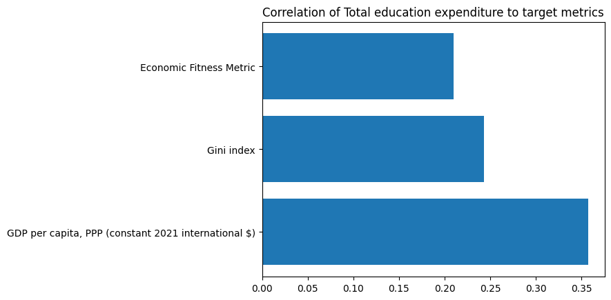
This graphic shows that all three metrics correlate positively to the total expenditure for education.
While only a correlation of 1.0 would show that each $ being spent to education would automatically in each case gain a higher metric, it still makes us confident that the expenditure goes well along with the average personal income and the international competitiveness as represented by the Economic Fitness Metric.
It also shows, that the Gini Index is tending higher with higher education spending, showing less equality in income distribution among the population. From this data alone we cannot tell, if this also correlates with an inequality of benefits of education expenditure among the populations.
It should be mentioned, that those correlations only can guide as a rough picture and should not lead to conclusions of casuality without further information.
To see if these correlations bear much of significance about single countries we undertake to have a look into the distribution for each country, represented by blue dots for each diagram, showing expenditure in relation to each metric as above. The expenditure is here always given in percent of a country’s GDP:
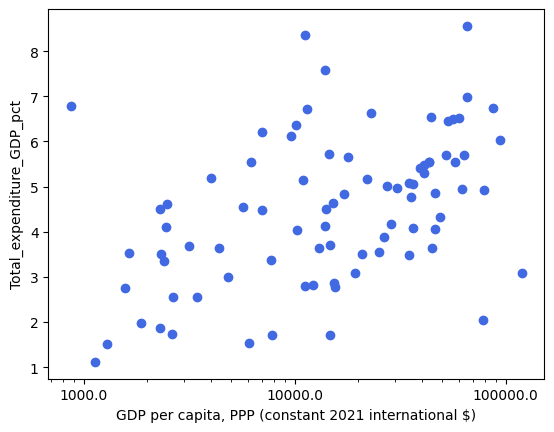
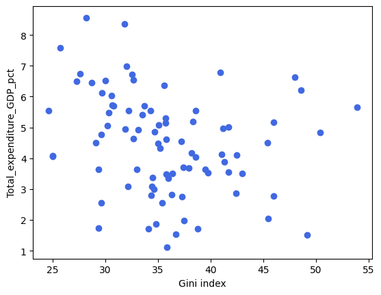
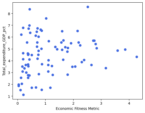
The scatter plots show a big variety over the whole field. We need to conclude that those simple correlations do not give much insight, beyond a slight tendency mentioned above.
Part III: Can effects be attributed to particular fields of government spending?
Now let’s have a more detailed look at the different forms of spending, as we could find them in our data. The following plots show the Shap Values for the different spending fields (total, and sperated for primary, secondary, and tertiary) and the three econimic metrics:
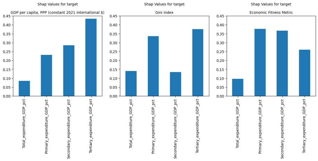
Those Shap values show, how much a value (as shown at the bottoms of the plots) contirbutes to the metric, as shwon in the titles.
Below are the same values, but grouped by the expenditures.
In both cases a longer bar shows bigger influence on the metric.
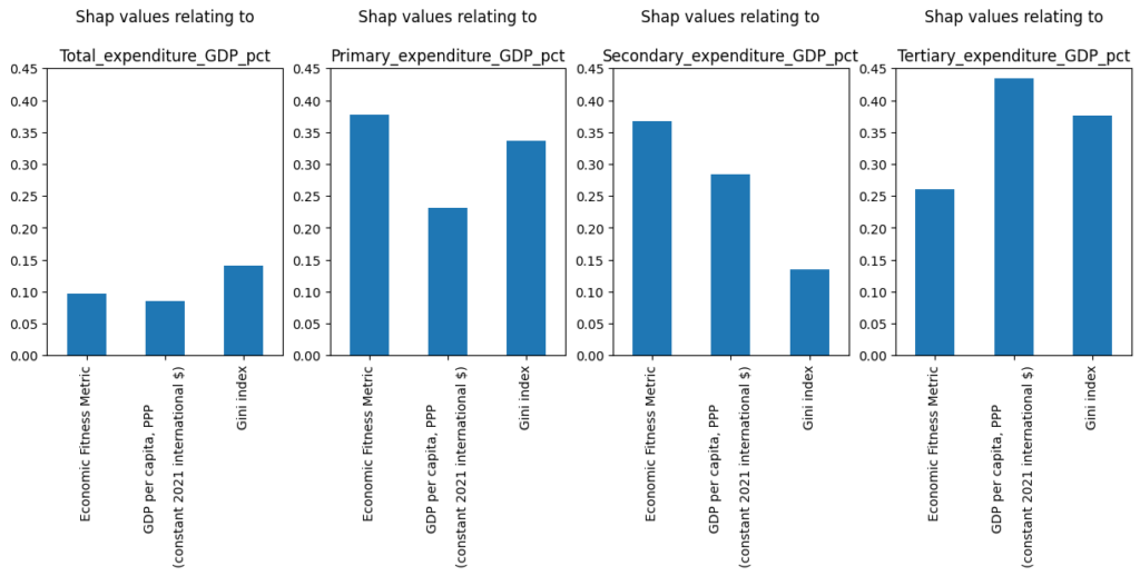
In the upper row we can see, that, when looking at GDP per capita in the left plot, the expenditure on tertiary education has the biggest influence, while the short bar for „total“ shows, that just looking at total expenditure does not much explain how big the influence on the GDP might be.
On the other hand, the Gini index has two peaks on primary and tertiary expenditure.
It might still be interesting to note that for the metric of Economic Fitness, tertiary expenditure has less influence than primary or secondary education.
The lower row of plots makes it easier to compare in which fields we can measure impact for a particular field of expenditure: Just looking at total expenditure (left plot) does not reveal big influence on the metrics, but looking at primary shows biggest impact on Economic Fitness, secondary show being weak in terms of explaining Gini-Index, while tertiary education has its peak in relation with GDP per capita.
One should not forget that we look at global data, with many nations having quite different situations compared to other nations in our data pool. While these global tendencies we found appear quite strong and reasonable, one should still bear in mind, that in a particular single nation the effects could still be different.
And overall, we measured investment of money. While money appears to be a prerequisite, investing of money would not always guarantee the same quality of education.
But investigating into quality of eduction in different nations would certainly be a challenge on its own.